Dare ProtoPlay

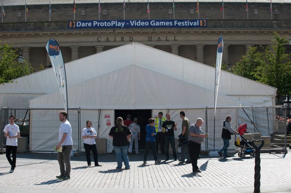
Dare ProtoPlay is the culmination of 2 months of development: the ultimate step in the Dare to be Digital competition. It is an event where everybody can play our games!

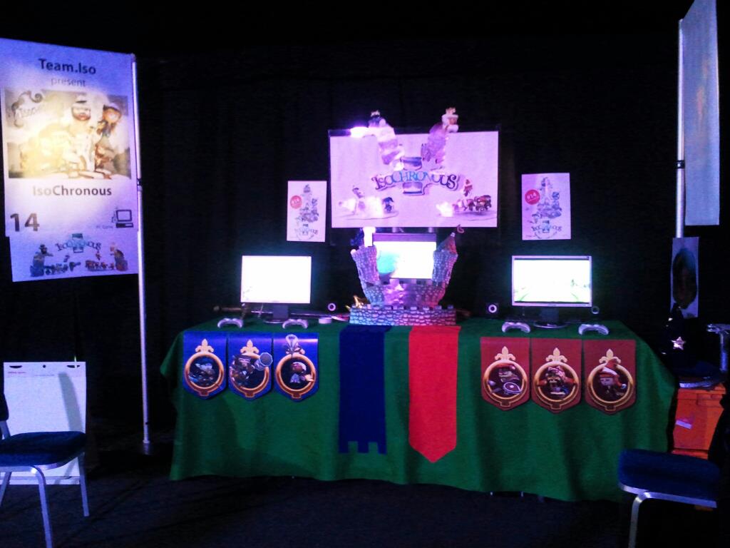
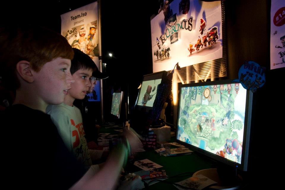
During 3 exhausting days a lot of people was able to play IsoChronous along all the other games of the competition. The booths of all the teams were amazing:


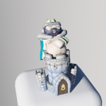
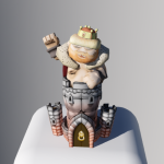
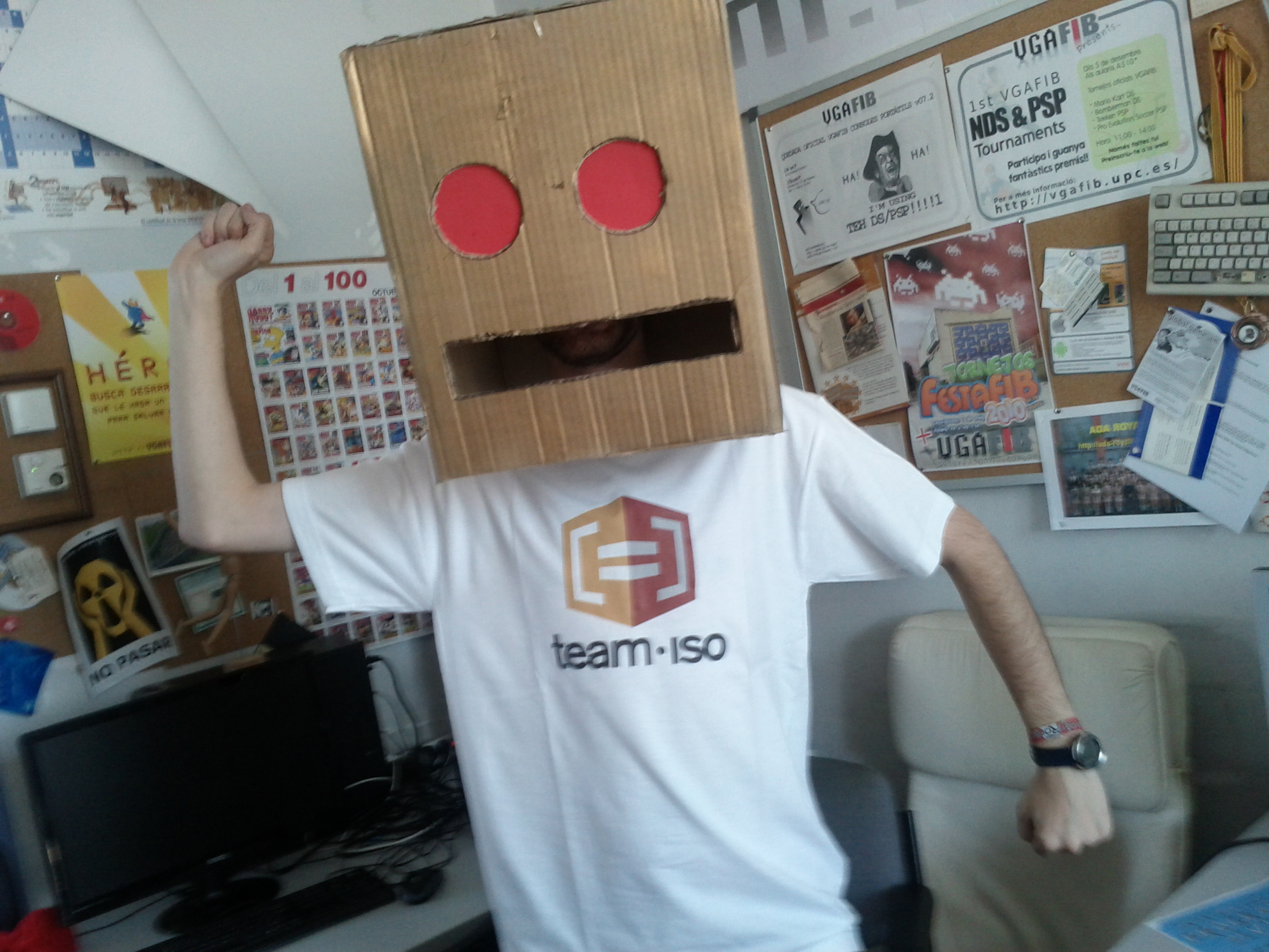
We decided to decorate ours with elements of the game, so we converted one of the screens into a fortified castle!

We were not sure enough if kids would enjoy 100% de game since the idea behind it is a bit complex, but in Dare ProtoPlay we found a LOT of kids playing again and again (also some of them coming after a while to continue playing it), so we can say that kids enjoy it too! There was also a great reception by adults: the whole process of understanding the game and trying to master it trying different strategies kept them engaged. We are very happy with the feedback from both kids and adults!

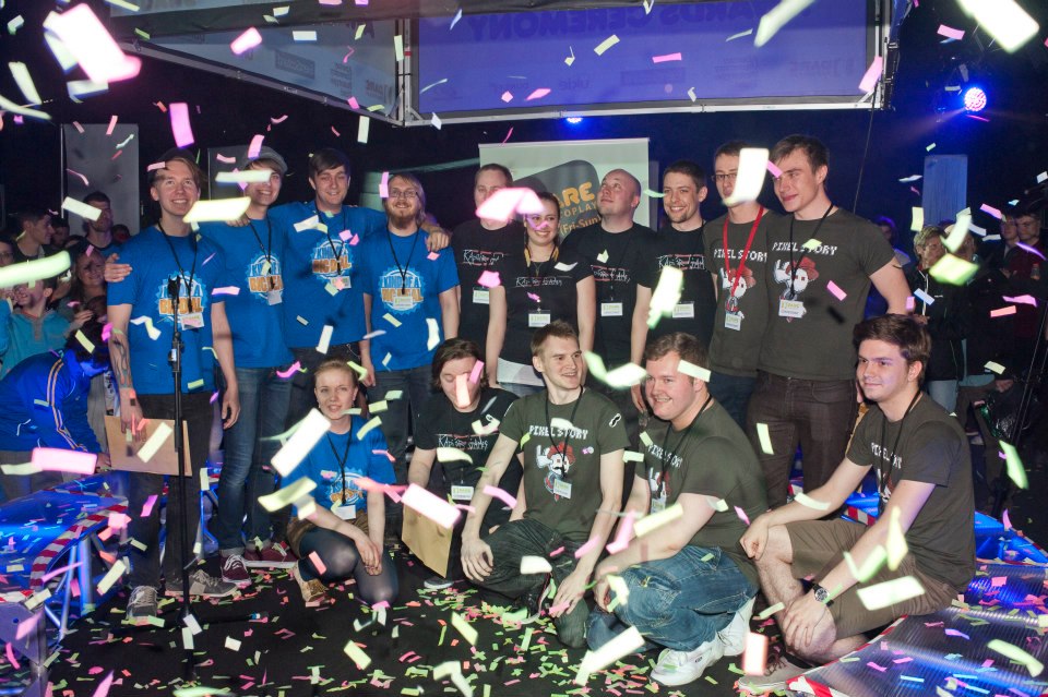
Finally, on Sunday took place the award giving ceremony. The 3 BAFTA nominations to the “Ones to watch” award were for our fellows who developed Pixel Story, Starcrossed and Project Thanatos. Good job guys!

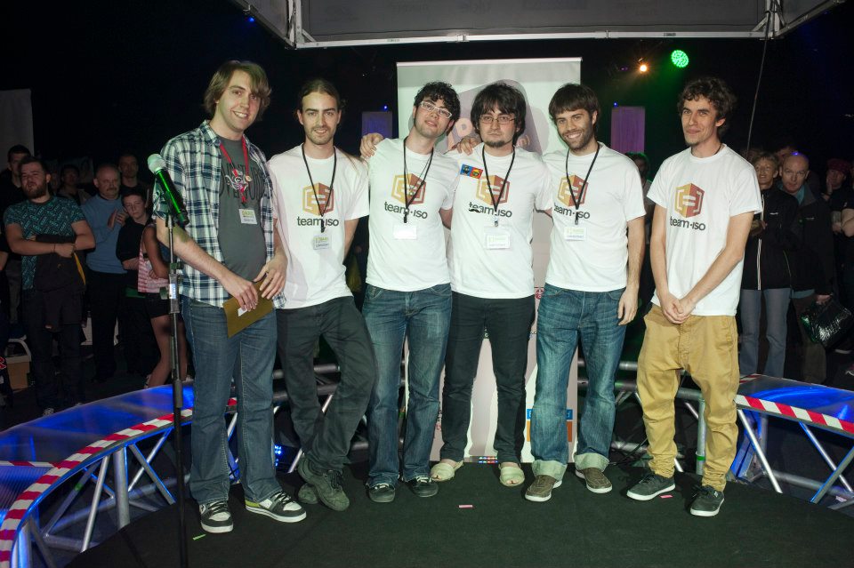
The public, with their votes during the event, chose Project Thanatos for the Public award, and finally we received the Team choice award given by the other teams!

Congratulations to everyone that has taken part in Dare to be Digital. because all the games done have been amazing. This two months working side by side with the other teams, sharing problems and ideas (and beers) have been awesome, so thank you all! Also thanks to the organizers for leting us enjoy this experience. For sure this is one of those summers that we will never forget.

IsoChronous – What´s next?

We are approaching the end of Dare to be Digital with 2 weeks left so this is going to be the last version and it’s planned to last until 8th August. During the next weeks we want to finish polishing the game working in:
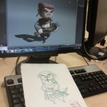
Adding the healer and the trapper as playable units. This incorporation will help the player to have a proper feeling of building his own army. Right now, with just 4 units per team all the battles end with the same units and this can make the player feel a bit disconnected with his army. With the new units and maintaining the 4 time layers we want the battles to end with different armies and let the player specialize and build his own army hopefully making him more connected to it.
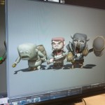
  

Changing the GUI: healthbars, selector flags and change all the texts with a custom font to make them more eye candy.

– Include a tutorial to show players the game mechanics if they need to.

Making victory animations to get the player feel rewarded when winning.

Adding a summary at the end of the battle with useful information about how the battle has developed. This has two reasons: on the one hand it gives rewards to both players: you can be the winner but not being the one that has defeated more units and on the other hand this helps both players understand what they have been doing well and what they have to improve so if you lose you get useful information that will help you to master IsoChronous.

– Working on a dynamic camera for the last replay so we can show a more cinematic and epic final replay to make the players want to watch and enjoy the whole battle.


IsoChronous – Dev diary week 6

3 weeks have passed since previous post, it could seem a lot, but we´ve been working hard all this time in the version entitled pandora. Also there has been a lot of work in the trailer with all the team helping to finish it.

So let´s see what has version pandora brought so far:

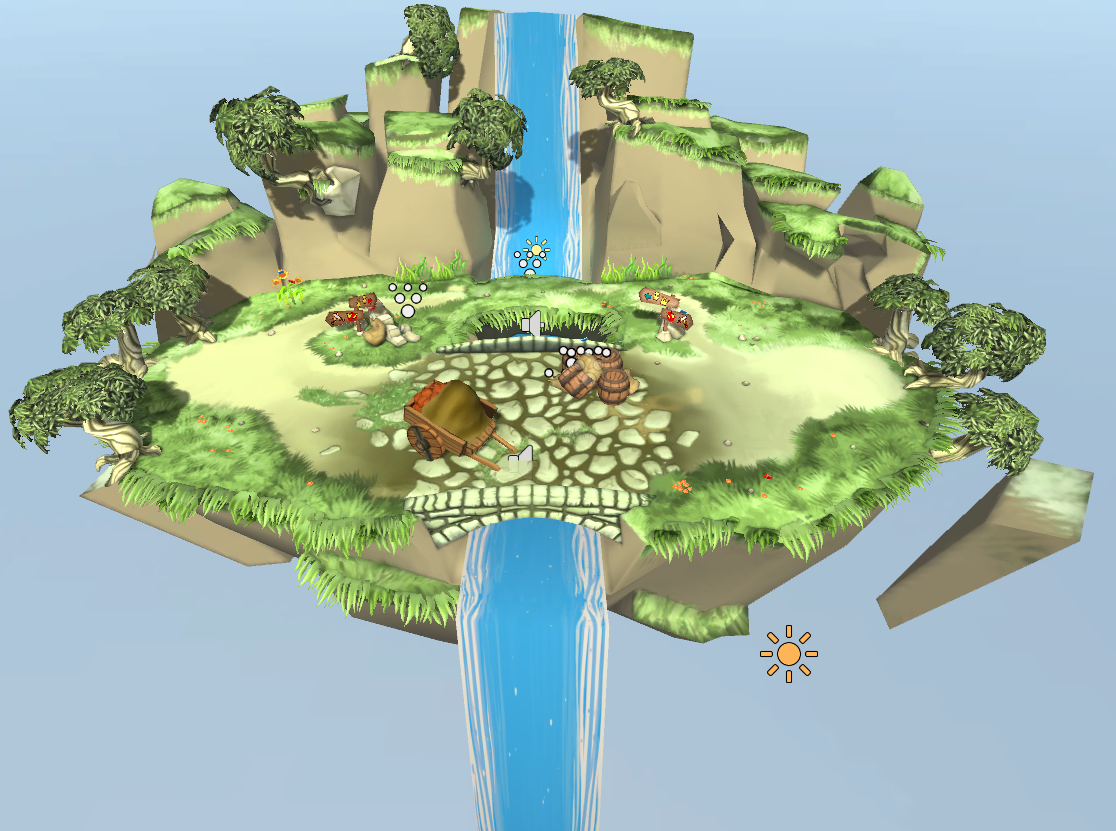
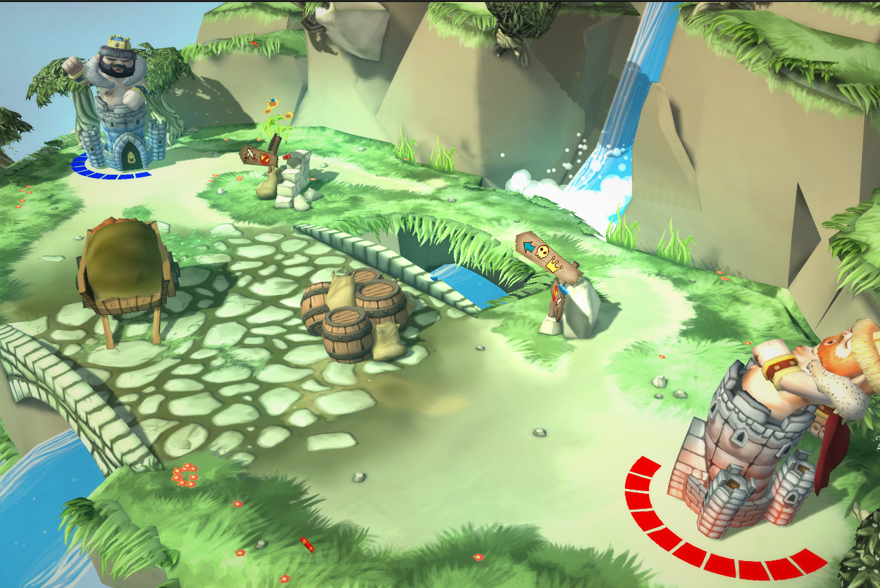
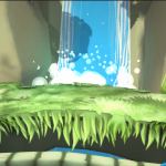
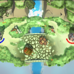
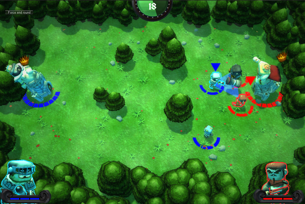
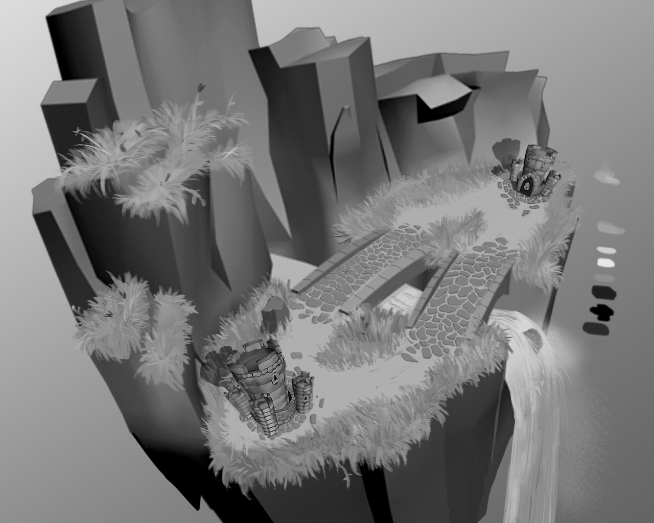
Level changed by pandora, a floating island in the middle of the sky with a river that divides the battlefield.

Added interactive environment and props: trees, caravan, sign posts, barrels, butterflies, flowers and seagulls so that everything is more alive and gives feedback making the player  feel better when attacking.

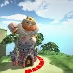
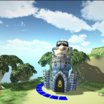
Camera travelling introducing IsoChronia and both kings so you can watch the scene and  the kings making them a bit more noticeable (still not obvious that the goal is having other player´s king with less health in the fourth time layer).

Sound fx for most of the interactions. Some of the sounds have been used to help player understand the game mechanics. For example the king says messages like: “Protect the king” and “Attack” to empathize what you are suppose to do. Also as they keep giving orders it gives the information of being important for the team.

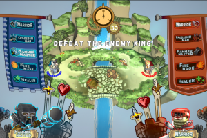
GUI redesign to include: small flags on top of the screen to give information about the total number of time layers in a battle, indicators of attack, health and speed to give information about the different units. The style of the GUI elements has been changed to be more integrated with the game: flags, towers and banners have been used. Time indicator is a needle clock to make more obvious that it is indicating time. When the time layer finishes the clock enlarges and is centered facilitating the player to understand that everything rewinds and that there is a clock.


As you can see, in general, we´ve worked a lot to improve player experience and making the battlefield stand out. Also the GUI has been redesigned to help player understand the game mechanics.


All this changes have been possible thanks to mentors which have been very useful testers. Also we would like to thank those other dare teams who have had time to play IsoChronous and have given their thoughts to improve it. Last but not least, the kids from the focus testing day have helped us to see that even without understanding the whole game mechanics, IsoChronous is still funny, we enjoyed a lot watching them play it and making up sounds for hammer master and the rest of the mighty warriors. Thank you .


IsoChronous – Dev diary week 3

Dare to be Digital 2012 week 3 comes to an end and we have reached PB version. This version has as major improvements the fix of the butterfly effect bug which caused that the replays could differ from what was recorded due to physics and that we interpolated positions of the units for the replay so a small difference could made the whole battle change, ending up in some cases in changing the results of the winner of a battle during the replay.

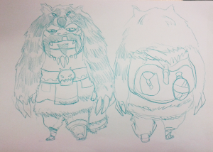
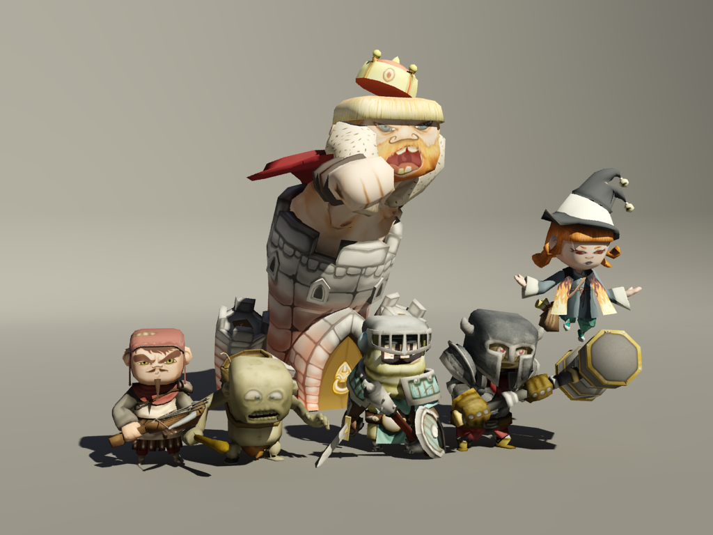
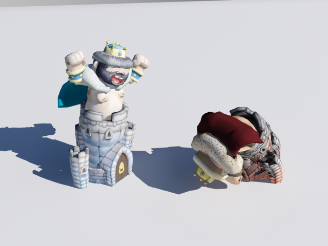
Regarding the units, the king is finished now. It’s by far, the most polished of all the units, with 6 animations and different textures to change his expression to mirror the state of the battlefield.


Finally, there have been improvements in the GUI, the render of the current unit is more polished and includes its health too and the previous hourglass has been changed by a semicircle.

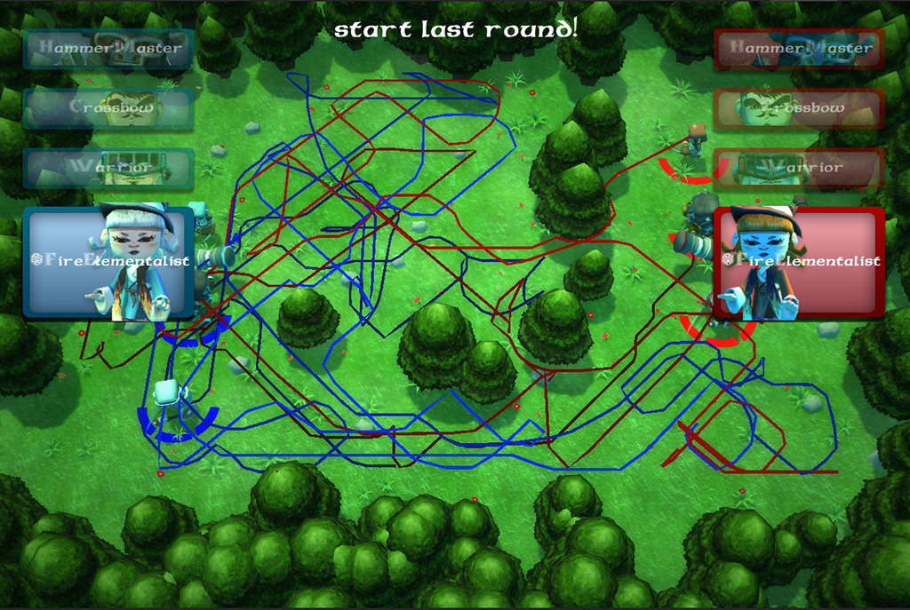
Another thing that we’ve been working on is in improving the information shown when a round ends as now everything ends static and we believe that useful data could be represented in the map to help people think their strategy easily. A first reasonable approach seemed showing each units path to aid the player in decide where to attack. After implementing this we ended with this:

Which looks like the a metro map. So we have discarded the idea and we will try in next approaches to simplify the information shown: trying with heat maps or a simplified points of interest maps.

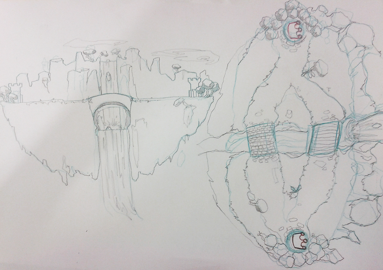
Next week we will be working on the version entitled Pandora. It’s name comes from the fact this version will include a new map that will replace the current one since we’ve been given the suggestion to avoid the current environment because it’s claustrophobic. The new map shows us a battlefield in the middle of a floating gorgeous island full of vegetation and a waterfall that separates the two reigns. You have some concepts and the design as a preview:

Pandora design

Dare to be digital 2012 First days

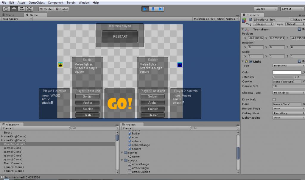
Today it’s the 4th competition day and mentors are going to visit us for the first time. Until now we have been working on finishing the playable prototype in order to address the playcentric approach we decided to apply to IsoChronous development as it has some parameters that will need a lot of testing to find the ones that provide the most enjoyable experience. So let’s see what’s been happening these first days:

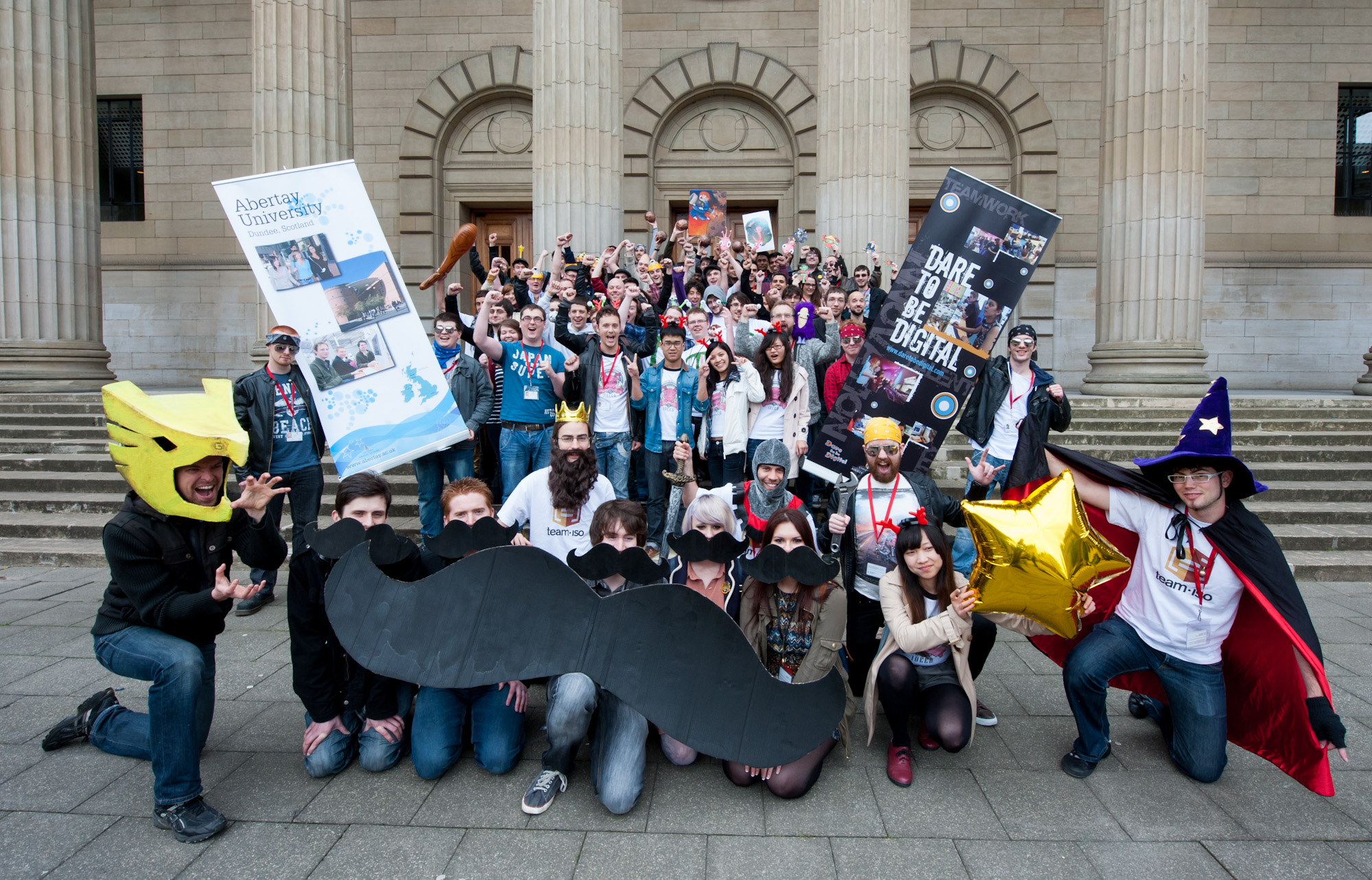
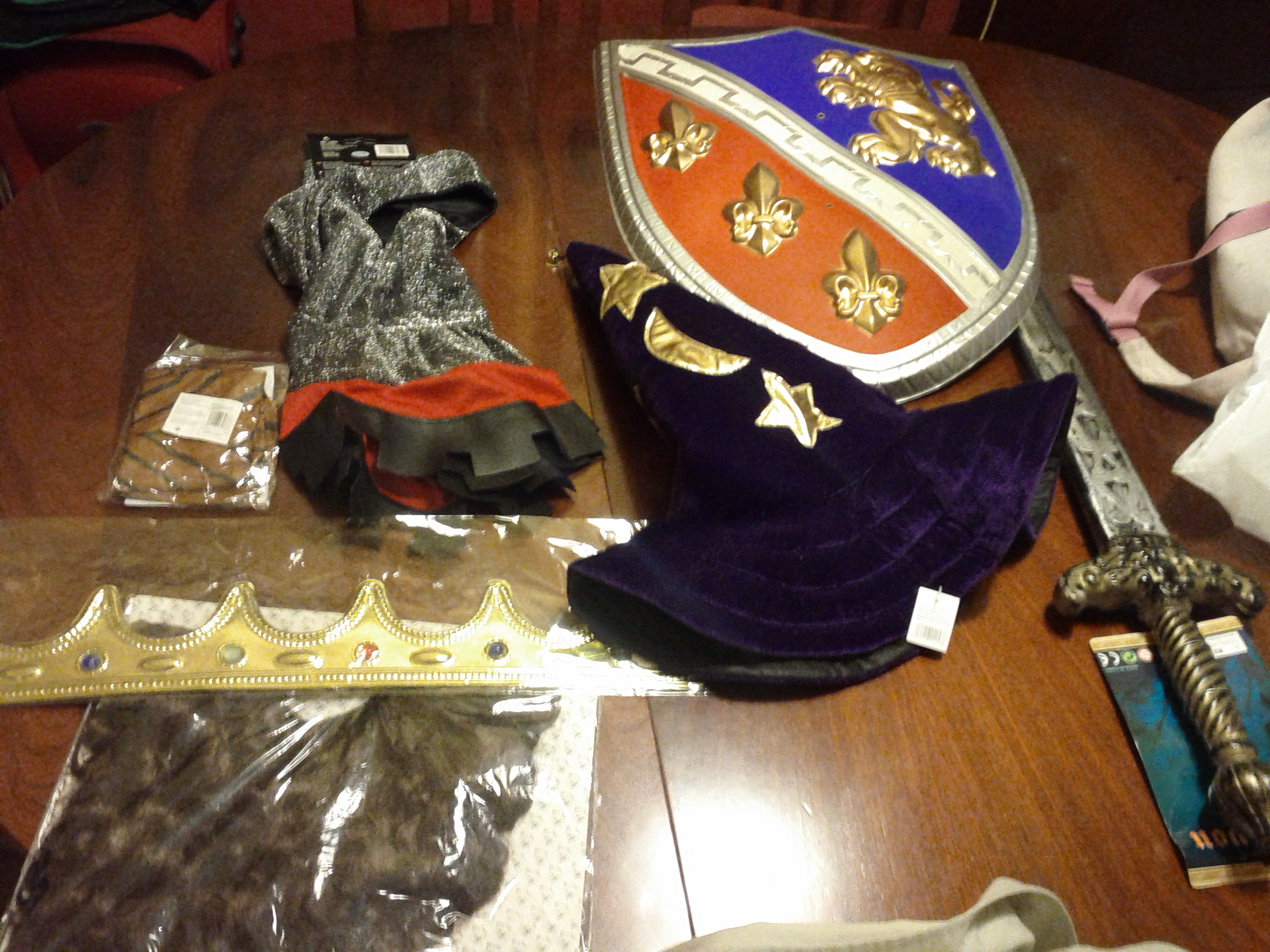
On Monday it was the induction day were we had to bring our props for the photo shoot. Everyone brought nice props that left us willing to know what the other team games were about (look that awesome big moustache and the gorgeous art from Finnish team):

After that we had lunch provided by the organisation in Albertay Union followed by an ice-breaking activity were everyone had to introduce the team and their game as well as what had been done during the available 40 h of work given before the start of the competition. Everyone seems nice and there are plenty of really interesting ideas out there.

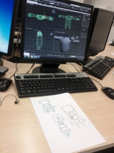
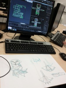
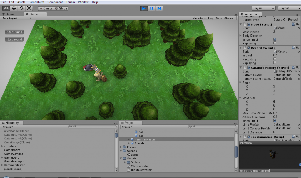
Second day was spent in having everything set up. There were some problems as we didn’t have Unity installed in our PCs and some drivers were needed for the graphic tablets  and gamepads but it was all fixed by the IT crew. We did some work in a new unit for IsoChronous, the crossbowman and also in the playable prototype:


 Finally, yesterday we were working hard all day to have the mentioned playable prototype ready finishing randomly generated environment and record mechanics. Our artists finished the crossbowman so this means we’ve 3 units ready! Now we’ve got something that looks like more like a real game.


Dundee arrival

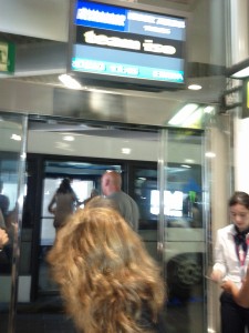
After 8 hours we’ve made up to Dundee. We have had to plan Dundee arrival in 2 stops: first one from Barcelona to Glasgow by plane and then what was left, by train to reach Dundee. To sum up the trip: it was hillarious watching our team name on boarding panel in the airport:

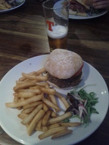
The first thing that blows you up is how greenish Scotland is. We’ve reached Glasgow Center at 18 and as our train was scheduled for 19:30 we’ve decided to lunch in a near pub where they had delicious hamburgers!


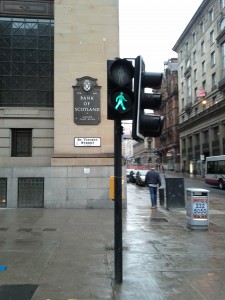
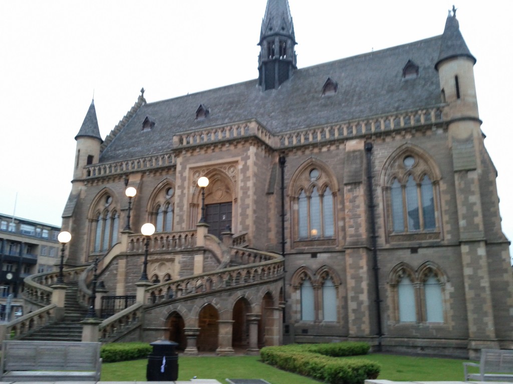
Finally at 21 we were at Dundee ready to roll. It looked like a ghost town at first glance as it wasn’t anyone in the street and this contrasts a lot with Barcelona but Dundee seems a gorgeous city willing to be discovered! Way to Security office to get our room’s keys we discovered a lot of beautiful old-style buildings:

We lost ourselves a bit but we were lucky to find some nice members of Raptor Games who helped us to get everything and showed how to reach Victoria Chambers. There we unpacked everything and made ourselves at home.


PS: you will find all the other photos here

Dare to be Digital 2012 selection day

Last week we went to London to show our project for Dare to be Digital 2012 to a group of judges from Sony, Jagex and BAFTA. The presentation was on Friday but we decided to go earlier to visit London, or at least we went with that thought as we ended finishing the presentation and practicing it from Wednesday until Friday in the apartment.

We worked a lot on it: we used Unity to make a small presentation with more interactivity than the standard PowerPoint or Prezi as we really wanted to stand out.  (You can download what we did here). We also made a small rehearsal with an inflatable club and a mop stick to demonstrate IsoChronous’ game mechanics. The presentation lasted 15 minutes and after that we had to answer 10 minutes of jury’s questions.


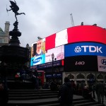
On Saturday we did a bit of tourism visiting Big Ben, Tate Musuem, St Paul’s Cathedral, Hyde Park, …