Dare to be Digital 2012 week 3 comes to an end and we have reached PB version. This version has as major improvements the fix of the butterfly effect bug which caused that the replays could differ from what was recorded due to physics and that we interpolated positions of the units for the replay so a small difference could made the whole battle change, ending up in some cases in changing the results of the winner of a battle during the replay.
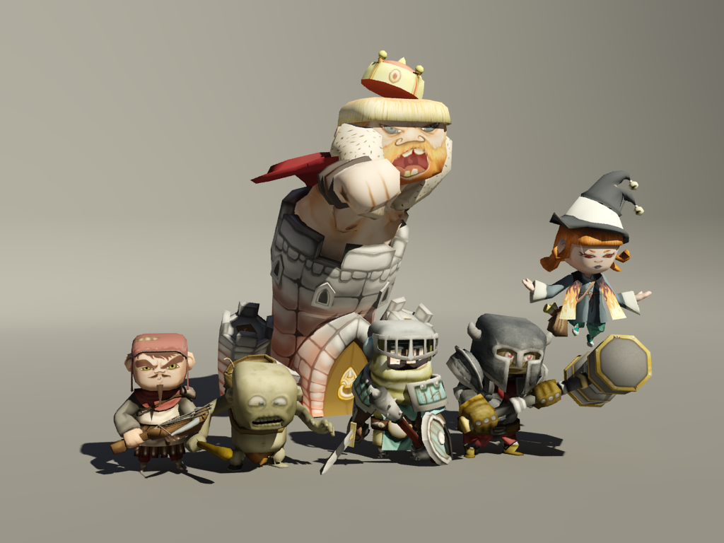
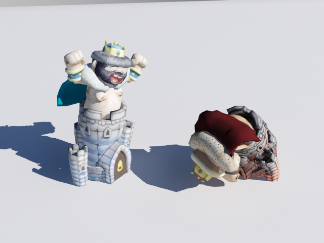
Regarding the units, the king is finished now. It’s by far, the most polished of all the units, with 6 animations and different textures to change his expression to mirror the state of the battlefield.
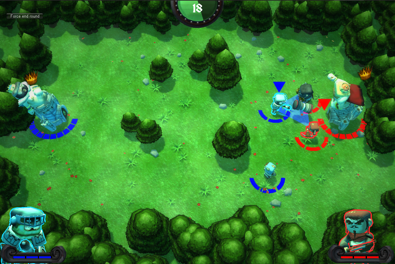
Finally, there have been improvements in the GUI, the render of the current unit is more polished and includes its health too and the previous hourglass has been changed by a semicircle.
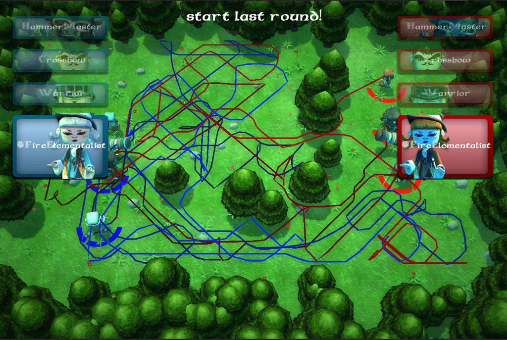
Another thing that we’ve been working on is in improving the information shown when a round ends as now everything ends static and we believe that useful data could be represented in the map to help people think their strategy easily. A first reasonable approach seemed showing each units path to aid the player in decide where to attack. After implementing this we ended with this:
Which looks like the a metro map. So we have discarded the idea and we will try in next approaches to simplify the information shown: trying with heat maps or a simplified points of interest maps.
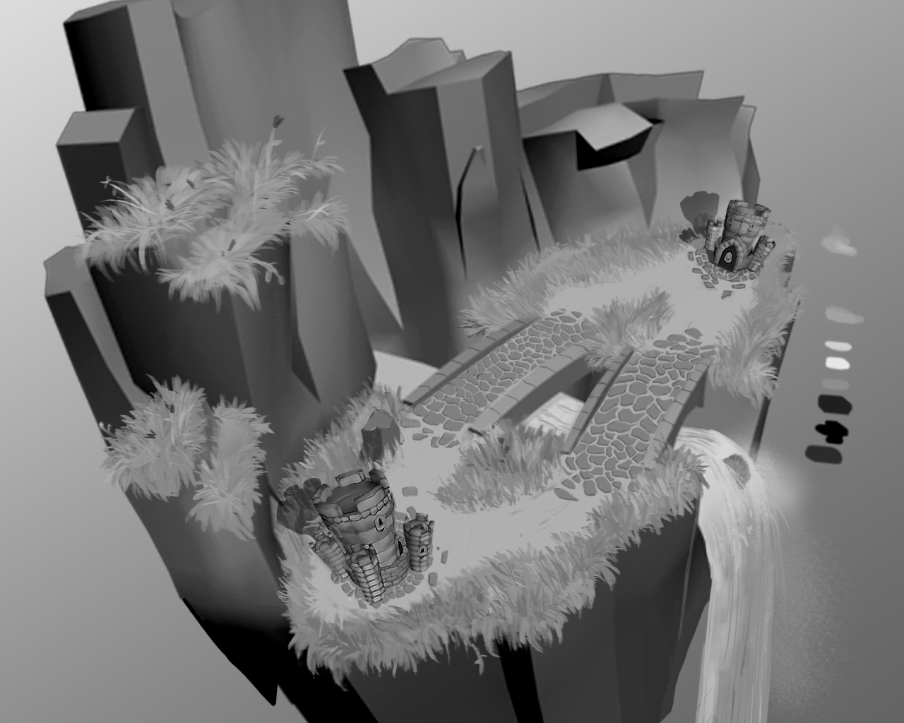
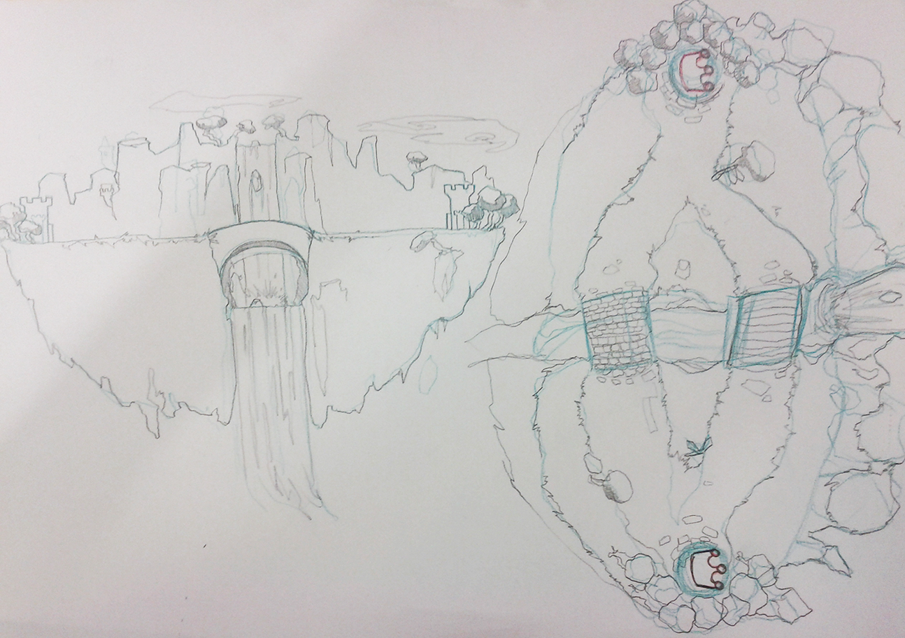
Next week we will be working on the version entitled Pandora. It’s name comes from the fact this version will include a new map that will replace the current one since we’ve been given the suggestion to avoid the current environment because it’s claustrophobic. The new map shows us a battlefield in the middle of a floating gorgeous island full of vegetation and a waterfall that separates the two reigns. You have some concepts and the design as a preview:

